Here, I will dispaly a selection of significant official artworks and give my analysis of his design.
(To see my fan art, click here.)
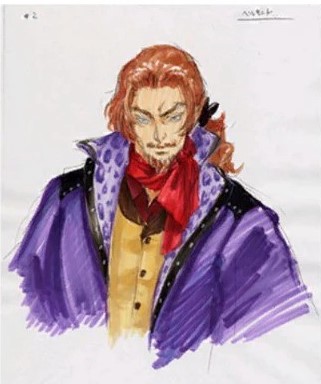

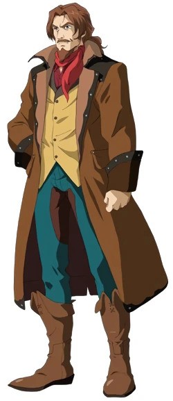
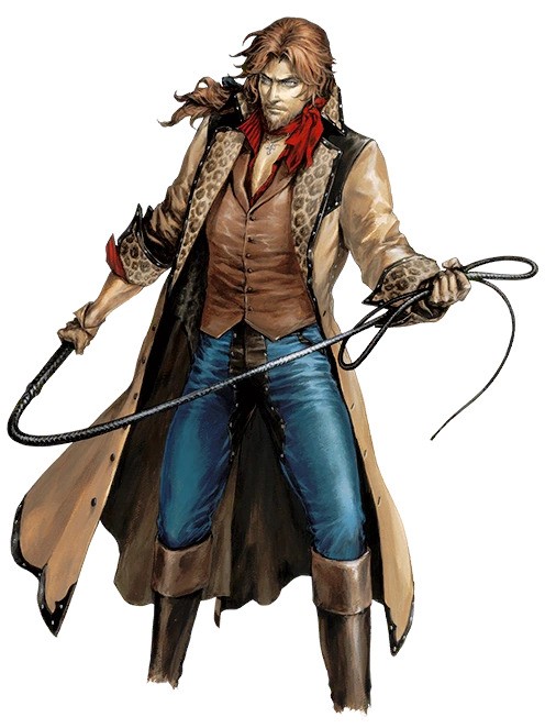
From left to right: Concept art, Aria of Sorrow (2003), Dawn of Sorrow (2005), Harmony of Despair (2010), Grimoire of Souls (2019).
So from the absolute beginning I've been fascinated by Julius Belmont’s design. There is a weird combination of old-fashioned and modern aspects to his outfit that work very well. His design manages to set him apart as a character, and yet it still manages to make him recognizable as a Belmont. Here, I will argue why I think his design is so effective.
Color and material
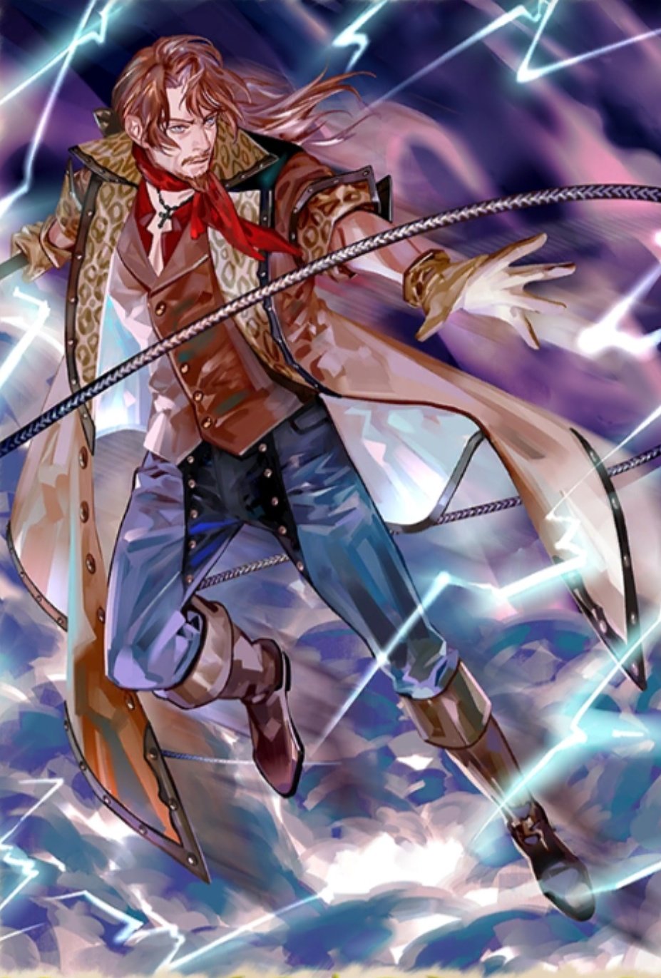
Julius’ color scheme is characterized by muted browns, combined with only primary colors (yellow waistcoat, blue jeans, and most importantly, the red scarf). His sprite art is mostly brown and orange, which makes a beautiful contrast with the electric blue of his iconic grand cross attack. The lack of flashy colors establishes him as more mature and serious, and it differs from the more royal aesthetics that you see in Juste and Léon for example. Julius has many leather aspects on his outfit, but they are more fashionable, and do not function as armor. This, together with his characteristic blue jeans, communicates that Julius is not a prepared warrior, due to his amnesia. Instead, he is an estranged man who wanders the world, but still a Belmont despite everything. (I do like how the concept art has a purple coat, although I don't think it would have fit his character very well.)
Age, past and future
There are both modern and old-fashioned aspects to Julius’ design. The jeans are undeniably modern, while the panther print coat and leather waistcoat can fit in a modern setting but would be seen as old-fashioned. His hairstyle, with bangs and a ribbon to tie his ponytail, gives a strong historical vibe. This combination of different aspects works to set Julius apart from other Belmonts as older, yet more modern. He is the only Belmont depicted in game with facial hair, and he dresses in clothes that most other Belmonts would have never seen. And at the same time, his dramatic coat, hair-tie bow and flowy scarf preserve his Belmont flair. In a more historical Castlevania setting, he would immediately stand out as a man from the future, but in the modern setting he lives in, he would be considered old-fashioned. This perfectly communicates the contrast in his character, where the past and the present are in conflict, and where he, although doomed to be an outsider, is still undeniably connected to his family history.
Design comparison between games
When comparing the art from different games, I like the Aria of Sorrow and Harmony of Despair designs the most. The AOS design is the most iconic in my opinion, but the Harmony of Despair art gives more details of his outfit, which is useful as a drawing reference. I also love the change from the yellow waistcoat to the leather one, which matches with the leather parts of his coat and reinforces his tacky yet incredibly cool grandpa look (and gives us a generous boob window because of the lower cut).
I don't like the Dawn of Sorrow design, because his clothes look ill-fitting, and they removed the panther print, which is an essential part of his design in my opinion. But I must respect this version for introducing his iconic leather-crotch jeans. The Grimoire of Souls design is basically the same as the design from Harmony of Despair, but I dislike how the inside of his coat is white there.
Conclusion
All in all, I think Julius' design perfectly captures the contrast between him as a modern Belmont and him as an old man stuck in the past. It is an unique yet coherent design that makes him instantly recognizable.
Fun fact: Some people say Julius might be based on Koji Igarashi himself, and although this was never officially confirmed, I do see the similarities.
Fun fact number 2: If you look closely, you can see that the collar of the waistcoat in the AoS design is patterned too. This is the only version in which this is the case. I choose to believe this pattern is panther print as well.